
Artists
Pop Art Prints by Rizzi, Friess and Lindenberg
Colour, signs, urban culture and humour connect three distinct approaches to popular contemporary art.
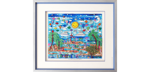
James Rizzi, Michel Friess and Udo Lindenberg use instantly recognisable imagery, yet differ markedly in line, collage, symbolism and tone. The first response to art is allowed to matter, but it should not be the only basis for a purchase. Matching a sofa or carrying a famous name does not guarantee that a work will remain rewarding for years.
At Berliner Bilder Galerie, contrasting Pop Art positions can be compared through visual language, spatial effect and personal association. A useful selection process does not set enjoyment against practical questions. Subject, size, material and intended location can be considered in sequence. That leaves room for a personal response without overlooking condition, framing or handling.
Notice what brings you back
Use Rizzi’s dense urban narratives as the first point to examine. Which work do you choose to see again without prompting? Sustained attention and curiosity matter more than a universally correct response. A work that opens slowly may be the right choice.
Compare favourites separately as well as side by side. A quieter second viewing shows whether colour or familiarity dominated briefly. See James Rizzi for a wider view of available media and subjects.
Turn a preference into a sound choice
- Rizzi’s dense urban narratives. Notice whether this aspect still holds your attention on a second and third viewing.
- Friess’s bold Pop references and collage. Judge the effect separately and in comparison, not only within a long list of images.
- Lindenberg’s figures, lettering and musical context. Clarify material, condition and handling while several works can still be compared.
- The impact of colour in the intended room. Include wall, light and presentation without making the artwork imitate the interior.
This is not a scoring system. Include the impact of colour in the intended room consciously in the decision. When judging the impact of colour in the intended room, a smaller piece may be stronger than a larger one, while restrained presentation can give an energetic image room to breathe. Include Lindenberg’s figures, lettering and musical context while several options remain easy to compare.
The page Michel Friess helps compare related artists, processes or themes. This is useful when a visual language appeals to you but you are not committed to one name. Similar colours do not guarantee a similar effect. Line, density, material and humour can separate two works completely.
Use online viewing for preparation
An online shop is valuable for narrowing subjects, sizes and types of work. Screen colour, crops and close-ups cannot communicate the physical scale of an original. Note any open question about Friess’s bold Pop references and collage and reduce the field to two or three serious options.
In a gallery, Rizzi’s dense urban narratives can be judged on the original at changing distances and in different light. Surface and scale become tangible, and missing information can be clarified. Questions are part of buying carefully, not a sign of hesitation.
Decisions that are often made too quickly
- Reducing all three artists to bright colour.
- Confusing similar subjects with the same style.
- Underestimating scale and framing for detailed works.
None of these questions benefits from artificial urgency. A shop selection is a snapshot and may change. Check Lindenberg’s figures, lettering and musical context against the specific offer.
Imagine the work in daily life
For the impact of colour in the intended room, a photograph of the wall, approximate dimensions and key furniture lines are more useful than a perfect drawing. Consider entrance and seating sightlines. Direct sun, radiators and narrow routes can rule out a location.
See Udo Lindenberg for further ideas about presentation. When judging the impact of colour in the intended room, works on paper may call for a mount, profile, glazing and carefully chosen depth; sculpture places more emphasis on plinth, stability and views from several sides.
Personal guidance in Berlin
Bring room photographs, wall measurements and saved favourites to a consultation on Kaiserdamm. Picture framing in Berlin provides the relevant contact or further information. Mention the works that interest you so that Rizzi’s dense urban narratives can be included in the discussion. Colour, surface and scale can then be compared without forcing a decision.
Choosing Art for a Living Room explores a neighbouring choice and may help narrow the field. It also considers Friess’s bold Pop references and collage, a question that is easy to miss during an initial browse.
Rizzi, Friess and Lindenberg offer more than bright colour
James Rizzi packs his city scenes with figures, movement and small narrative incidents. Michel Friess works more directly with collage, brand imagery and references to Pop and street culture. Udo Lindenberg relies on economical line, handwriting and instantly recognisable characters. Placing all three under a single label of colourful Pop Art misses the differences that make one work more suitable than another.
Try comparing composition and tone before looking at the artist’s name. Do you want an image that reveals new details over time, a bold visual statement or a reduced figure with a musical association? Scale and framing can then follow that preference. Densely worked prints need a viewing distance that preserves their detail, while broad motifs must remain convincing from across the room.
Pop Art does not have to dominate a room. A smaller print with one clear figure can provide a precise accent, while a crowded city scene needs a position where viewers can move closer. Compare narrative pace and viewing distance as well as colour. This is where works by James Rizzi, Michel Friess and Udo Lindenberg can differ markedly despite sharing a broadly popular visual field.
Conclusion
A successful choice combines personal attraction with clear information. Begin with your own response, then consider Rizzi’s dense urban narratives, Friess’s bold Pop references and collage, Lindenberg’s figures, lettering and musical context and the impact of colour in the intended room. This keeps the decision personal without overlooking how the work will function in daily life.
Frequently asked questions
What particularly distinguishes Rizzi from Friess?
Rizzi often builds detailed urban stories, while Friess works more directly with bold imagery, brand aesthetics and collage.
How does lettering function in Udo Lindenberg’s art?
Words, titles and concise messages often form part of the image, connecting drawing, character and musical persona.
What framing suits colourful Pop Art?
A restrained frame can organise a forceful image. Mount, profile and glazing should still be chosen for the individual work.
Would you like personal advice in Berlin?
Bring your questions, room situation or artwork to Berliner Bilder Galerie. We will help you compare suitable options for art, framing and presentation.